
How it came to be what it is
Our requirements
We needed a logo that was:
- Concise
- Associated with IPMS
- Club specific
- Aesthetically pleasing
The problem
We really liked the idea of both East and West Sussex shields but found that having both shields next to each other made the logo either too big or a little hard to see if reduced in size so we had to get a little bit inventive.
The original logo
![]()
The other issue was that the red (West Sussex shield) appeared to overshadow the wording.
So we looked into what we might do to keep them both and, after much messing about with scissors, paper, notepads and Ideas (and Google), we came up with a potential logo that appeared to have all the required elements as both an aesthetic and a memorable logo.
The new logo
We hope you like it.![]()
Background
Heraldry
In heraldry, it was normal to combine two shields and there were two methods. The method that we used is called impalement.
In heraldry, impalement is a form of heraldic combination or marshalling of two coats of arms side by side in one divided heraldic shield or escutcheon to denote a union. (Thanks Wikipedia).
Our decision
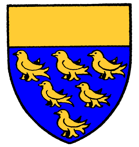
We decided that we would try impalement and use both the East Sussex and West Sussex shields to form a single shield; the East Sussex shield on the Right (To the East) and the West Sussex Shield on the left (To the West).
And that was a challenge…
Shield History
West Sussex
 West Sussex County Council promptly applied to the College of Arms for a grant of arms, which were granted on 18 May 1889. The cost of the grant was met by the Duke of Norfolk, a member of the council and titular head of the College of Arms. West Sussex was the first county council to become armigerous.
The arms were the same as those associated with the historic county with the addition of a gold “chief” or band at the top of the shield. The blazon or technical description was: Azure, six martlets, three, two and one a chief or.
West Sussex County Council was granted new arms on 14 January 1975. The gold chief of the 1889 shield was modified by being given an “indented” edge. A crest was added, shown atop a helm and decorative mantling. The crest represented the areas transferred from East Sussex and Surrey in 1974: the Saxon crown was taken from the East Sussex arms and the acorns from those of Surrey.
The blazon of the arms is: Azure six martlets three two and one and a chief indented or, and for a crest on a wreath of the colours a sprig of oak proper fructed with two acorns or within a Saxon crown also or.
We adopted the 1889 shield for the West Sussex part of our logo.
East Sussex
 East Sussex County Council adopted a seal in 1889. The seal bore a quartered shield. The first quarter represents Sussex, while the second, third and fourth quarters each represent one of the traditional Sussex subdivisions, known as rapes, administered by East Sussex County Council at the time.
- The first quarter bore the traditional six gold martlets on blue of Sussex
- The second quarter consisted of gold and blue checks from the arms of the De Warenne family, Earls of Surrey and lords of the barony of Lewes
- The third quarter was gold with a red displayed eagle, arms of the De Aquila family, lords of the rape of Pevensey
- Representing the rape of Hastings, the fourth quarter bore the arms of Hastings
These unofficial arms remained in use until 1937 when a grant of arms from the College of Arms was obtained on 10 September. A red shield was adopted and a gold Saxon crown was added for heraldic difference. The arms were blazoned as: Gules, six martlets three, two and one, and in chief a Saxon crown or
East Sussex County Council was granted a new coat of arms on 29 August 1975. The arms are identical to the 1937 grant with the addition of a silver wavy line, representative of the coastal county boroughs of Brighton, Eastbourne and Hastings added to the county in 1974.
We adopted the 1975 shield for the East Sussex part of our logo.
Club Specific
The Shield Shape
![]() The Two shields and new martlets were brought together to form the Mid Sussex component of the logo. This was a challenge as most shields appear to have differing shapes and proportions. So this pleasing heraldic shield shape was chosen as the shape for our shield.
The Two shields and new martlets were brought together to form the Mid Sussex component of the logo. This was a challenge as most shields appear to have differing shapes and proportions. So this pleasing heraldic shield shape was chosen as the shape for our shield.
East and West become Mid-Sussex
![]() We then combined the East and West Sussex shields, but without the martlets so that we would have a clean starting point before attempting to create the details.
We then combined the East and West Sussex shields, but without the martlets so that we would have a clean starting point before attempting to create the details.
Martlets
Making them fit
The shield of the county of Sussex in England contains six martlets said to represent the six historical rapes, or former administrative sub-divisions, of the county. It seems likely this bore a canting connection to the title of the Earls of Arundel (the French word for swallow is hirondelle), who were the leading county family for many centuries, or the name of their castle. (Thanks again Wikipedia)
We created our own version of the Martlets from one found on the internet that was very clear, but it was not quite correct; the tail was too low and caused issues when trying to place six on the shield. The original tail with the new tailI is shown here (Original tail without the colour).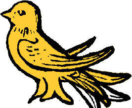
So with a little Photoshop magic, we were able to move the tail and create our perfect martlet.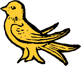
Placing them
We used six of these modified martlets in the foreground of the single shield and this completed it nicely.![]()
The IPMS Logo
We wanted to use the IPMS logo but “Brand” it for the Mid-Sussex branch.![]()
Associating with IPMS
Placement
We placed and sized our new Mid-Sussex shield centrally and in front of the IPMS logo and it looked OK, but it was just a bit too dominating and also covered the global area of the IPMS logo too much.![]()
Stained Glass
An attempt to give a stained glass effect was done by making the shield (but not the martlets) semi-transparent and this improved it a lot, but the world map was too blue and dark under the red.![]()
Trick of the eye
So we created a red component that transformed the blue underneath and gave the illusion of stained glass.![]()
Tweaks
Once this was in place, it looked much better but still needed a few teaks.
So we made the shield slightly more transparent (except its outlines and the martlets) and modified the IPMS logo details behind it so that they showed up just a little bit more, but not too much.
We also modified the colours used on the IPMS logo where they were behind the shield so that they did not make the shield look muddy and dirty.![]()
Aesthetically Pleasing
This completed the requirements by giving us an aesthetically pleasing glass effect and completed the logo.